Minecraft KitPvP Thumbnail

Minecraft KitPvP Thumbnail 2016-07-19

No permission to download

HyperLabs

Respected User
Freedom! Member
Mar 22, 2015
117
51
YouTube
ItsJackLads
HyperionCreative submitted a new resource:

Minecraft KitPvP Thumbnail - A bright and colorful thumbnail to spruce up your Minecraft videos!

Have you been looking for a thumbnail to make your Minecraft videos look better? Well maybe try this one out. Unfortunately I can't make it easy for the Character to be changed so if you don't like the flash.. My bad. The text can be removed if you would like to use the thumbnail for any other series and please feel free to ask me any questions I'm always around :)
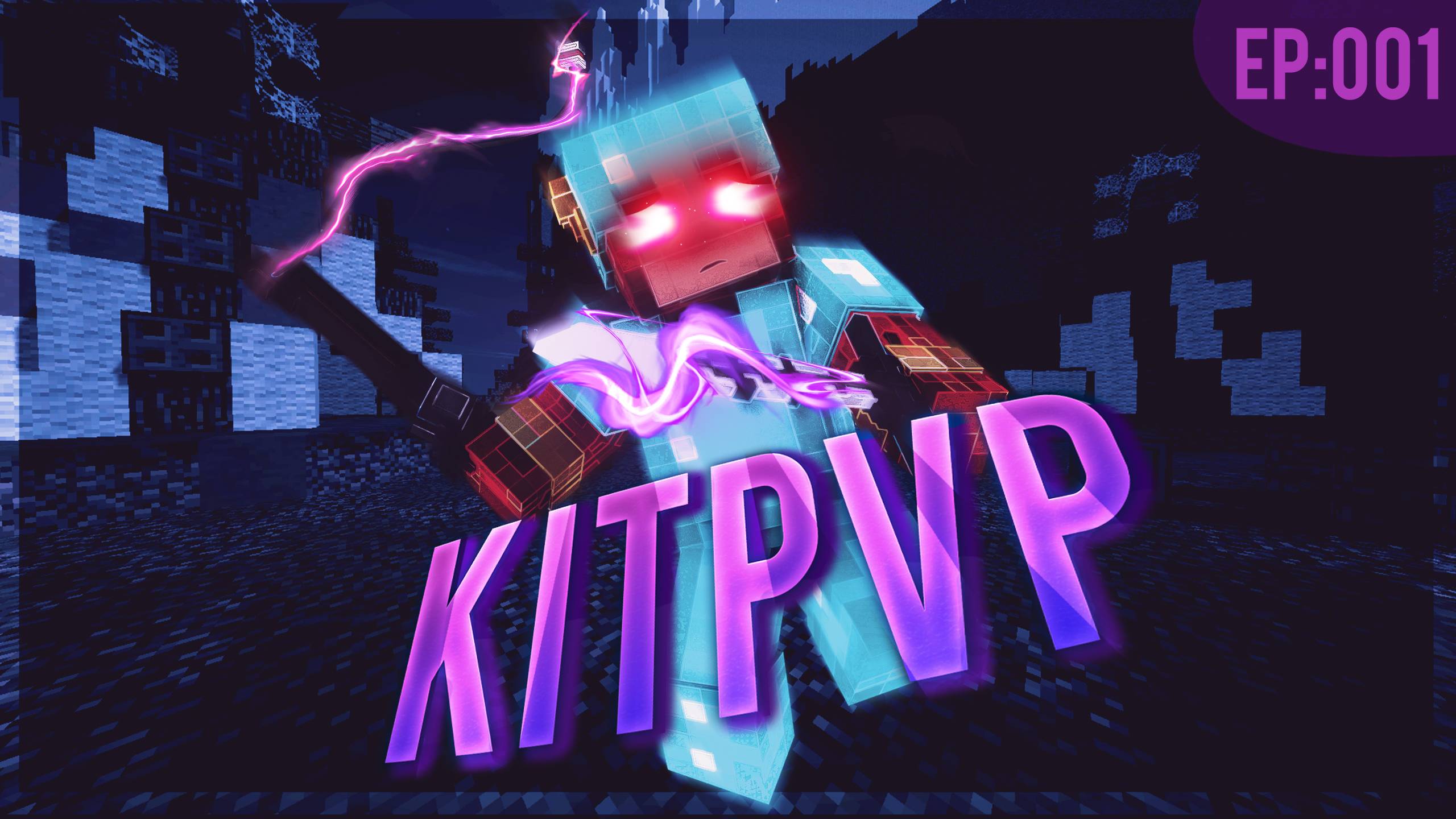


Thumbnail Includes:
Changeable Episode number
Removable text character and...

Read more about this resource...
 

HyperLabs

Respected User
Freedom! Member
Mar 22, 2015
117
51
YouTube
ItsJackLads
Sorry that this is a really long reply but as a Graphics Designer its really hard for me to make this short and i'm still not the best at explaining things. if you want an example of how I do my current thumbnails to make them stand out check out my channel and it has a lot of different thumbnails you may like.

So what I would suggest you do is make your character look more appealing by positioning it better and maybe extruding its features to give it a better look in general also making sure there are no glitches on the models texture would help too because if you look at the feet. they don't really look right. Usually I like too keep only the upper part of the model/skin in the thumbnail it just depends on how I want it too look. Next of make the key features of the thumbnail stand out a little bit more so maybe move the characters above the color fade and try setting your self 1 or 2 colors for the entire thumb nail. If you look at what my one i made is. I basically tried to keep it in the purple and pink color scheme.

If you have photoshop you might want to learn how to use all the color correction tools because I found that after learning about them and how they worked I was able to make better thumbnails in general and even if you just download a few photoshop templates for that kind of stuff it will help you a ton when it comes to making the entire thumbnail look better.

Last thing that Id really mess with is the text and I don't really go for the simple one color design I like to add shadows and effects over them using clipping masks and photoshop tools to add some depth and uniqueness to it so that when your scrolling down youtube its going to stand out above other videos and make people want to click on them.
 

TheGamingEdge

Rising User
Freedom! Member
Apr 28, 2016
39
3
YouTube
Sorry that this is a really long reply but as a Graphics Designer its really hard for me to make this short and i'm still not the best at explaining things. if you want an example of how I do my current thumbnails to make them stand out check out my channel and it has a lot of different thumbnails you may like.

So what I would suggest you do is make your character look more appealing by positioning it better and maybe extruding its features to give it a better look in general also making sure there are no glitches on the models texture would help too because if you look at the feet. they don't really look right. Usually I like too keep only the upper part of the model/skin in the thumbnail it just depends on how I want it too look. Next of make the key features of the thumbnail stand out a little bit more so maybe move the characters above the color fade and try setting your self 1 or 2 colors for the entire thumb nail. If you look at what my one i made is. I basically tried to keep it in the purple and pink color scheme.

If you have photoshop you might want to learn how to use all the color correction tools because I found that after learning about them and how they worked I was able to make better thumbnails in general and even if you just download a few photoshop templates for that kind of stuff it will help you a ton when it comes to making the entire thumbnail look better.

Last thing that Id really mess with is the text and I don't really go for the simple one color design I like to add shadows and effects over them using clipping masks and photoshop tools to add some depth and uniqueness to it so that when your scrolling down youtube its going to stand out above other videos and make people want to click on them.

I'm assuming you used Cinema 4D?